Title of the focus Optional subtitle
First paragraph.
Another paragraph.
Another paragraph. Please mind the overall length of the text. The block is fixed height.
Document updated at: 28/03/2014
If you have any question, plese ask Simone and Cristiano: info@codexcoop.it
Your site is managed by a custom installation of WordPress.
The basic content types of WordPress are Pages and Posts. In your installation there are two more custom content types: Products and Publications.
Please follow these general rules when writing content through the admin interface:
If you wish to maintain the cases you type, just add <span class="text-normal"> to the text. Example:
More of the <span class="text-normal">CELLnTEC</span> story
The site is coded in HTML 5, the appearance is ruled by CSS 3.
For easier maintenance it is strongly advisable to use semantic markup.
If you need styles not covered by the current CSS, it's better to modify the CSS rather than apply presentational markup or inline styles.
In order to avoid weird rendering and validation errors, please follow the following rules when you write HTML in the content field:
h1 (that is reserved to page header).font.align.target="_blank" is not necessary.Templates are structures of content.
They control how your pages will be displayed, mixing dynamically generated content and editable content in predefined order.
Set the appropriate value (if present) under Page / Page attributes / Template.
Legend: D = dynamically generated; E = editable through the admin interface
| Home | Automatically applied to Home page. |
|---|---|
| Section |
Apply to pages: Products, Services.
|
| Category |
Apply to most pages descendants of Products (i.e. Skin or Skin / Keratinocyte 2d) and Services.
|
| Full width | Apply to pages with full width text (i.e. Ordering Europe). |
| Product |
Automatically applied to single Product page (= Pod). The content is editable under Products.
|
| Publications | Automatically applied to Publications list page (= Pod). The content is editable under Publications. |
| Publication | Automatically applied to Publication details page (= Pod). The content is editable under Publications. |
| News | Automatically applied to News pages (index and single news). The content is editable under Posts. |
| Sitemap | Automatically applied to Sitemap page. |
Patterns are snippets of content you can put in Pages. Here there are: usage description, markup and preview.
One per page. Recommended at the beginning of the page.
In More fields set a value for Background focus (the image to be used as background, placed on bottom right of the block).
The image must be a transparent PNG, 760 x 720px.
If the Background focus is empty, the fallback background will be the image you see in the example below.
In section Products the title of the focus will automatically get the color of the respective category (pink for Skin, green for Oral, etc.)
<div id="focus">
  <div class="text">
    <h2>Title of the focus <span>Optional subtitle</span></h2>
    <p>First paragraph.</p>
    <p>Another paragraph.</p>
    <p>Another paragraph. Please mind the overall length of the text. The block is fixed height.</p>
    <p><a href="#"><i class="arrow">»</i></a></p>
  </div>
</div>
First paragraph.
Another paragraph.
Another paragraph. Please mind the overall length of the text. The block is fixed height.
If you want a text link (instead of the icon only) use this markup:
<p class="link-primary"><a href="#">Text link with icon</a></p>
One or many pairs per page.
In section Products the title of the teasers will automatically get the color of the respective category (pink for Skin, green for Oral, etc.)
<div class="teasers">
  <div class="odd">
    <h2>Title of the odd teaser <span>Optional subtitle!</span></h2>
    <p>Text of the teaser. The length of this text must be approximately equal to the one of the paired teaser. Look right: are the lengths equal?</p>
    <p class="link-primary"><a href="#">Product features</a></p>
  </div>
  <div class="even">
    <h2>Title of the even teaser <span>Subtitle required if used in the odd teaser</span></h2>
    <p>Text of the teaser. The length of this text must be approximately equal to the one of the paired teaser. Look left: is it everything ok?</p>
    <p class="link-primary"><a href="#">Powerful simplicity</a></p>
  </div>
</div>
In case of adjacent pairs of teasers, divide them by adding the element <hr> (horizontal rule).
<div class="teasers"> … </div>
<hr>
<div class="teasers"> … </div>
One or many per page.
The article is made of an image and a text.
By default the image is placed on the left; the title color is blue light and the background is white.
In section Products the title of the article will automatically get the color of the respective category (pink for Skin, green for Oral, etc.).
<div class="article">
  <div class="image">
    <img src="https://placehold.it/320x320" alt="">
    <p class="caption">Optional caption.</p>
  </div>
  <div class="text">
    <h2>Title of the article <span>Optional subtitle</span></h2>
    <p>First paragraph as long as you need.</p>
    <p>Another paragraph as long as you need.</p>
    <p class="link-primary"><a href="#">Optional link</a></p>
  </div>
</div>
Optional caption.
First paragraph as long as you need.
Another paragraph as long as you need.
If you want to place the image on the right, add the class article-inverse to the container <div>.
<div class="article article-inverse">
First paragraph as long as you need.
Another paragraph as long as you need.
If you want to change the colors, add the class article-N to the container <div>, where N is a number between 1 and 3.
<div class="article article-1">
First paragraph as long as you need.
Another paragraph as long as you need.
<div class="article article-2">
First paragraph as long as you need.
Another paragraph as long as you need.
<div class="article article-3">
First paragraph as long as you need.
Another paragraph as long as you need.
If you want to place the image on the right and change the colors, add both classes article-inverse and article-N to the container <div>, where N is a number between 1 and 3.
<div class="article article-inverse article-1">
First paragraph as long as you need.
Another paragraph as long as you need.
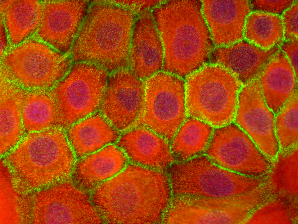
Zoomable image. Enclose the img element in a link element with class zoom.
The src attribute of the img element must be the thumbnail size image (320x320px).
The href attribute of the a element must be the full size image.
<a class="zoom" href="/wp-content/uploads/jpg/Cell3.jpg"><img alt="Cell3" srcset="/wp-content/uploads/jpg/Cell3-320x320.jpg, /wp-content/uploads/jpg/Cell3-320x320@2x.jpg 2x"></a>
Block showing information related to products, laid out in 4 columns.
Applicable only to pages under Products, with template Category. One per page.
In More fields check Show block Info Related if you want that (the block will be shown at the end of the page).
<div id="info-related">
<div class="info">
  <a href="/products/resources/protocols/"><i class="icon icon-protocols"></i></a>
  <h3>Protocols</h3>
  <p>The perfect cells and media are still only two parts of the puzzle.</p>
  <div class="link"><a href="/products/resources/protocols/"><i class="arrow">»</i></a></div>
</div>
<div class="info">
  <a href="/products/reagents/"><i class="icon icon-reagents"></i></a>
  <h3>Reagents</h3>
  <p>Enzymes, antibiotics, defined freezing media.</p>
  <p>Everything you need for your cultures.</p>
  <div class="link"><a href="/products/reagents/"><i class="arrow">»</i></a></div>
</div>
<div class="info">
  <a href="/products/resources/tech/"><i class="icon icon-tech-info"></i></a>
  <h3>Tech Info</h3>
  <p>Ever wondered how feeders were replaced? Or why regular media aren’t great for differentiation?</p>
  <div class="link"><a href="/resources/tech/"><i class="arrow">»</i></a></div>
</div>
<div class="info">
  <a href="/products/ordering/"><i class="icon icon-ordering"></i></a>
  <h3>Ordering</h3>
  <p>Either direct from CELLnTEC, or through a distributor.</p>
  <p><a href="/products/ordering/"><strong>Here is the info on how to order</strong>.</a></p>
  <div class="link"><a href="/products/ordering/"><i class="arrow">»</i></a></div>
</div>
</div>
Shortcode for creating a pdf viewer in modal window.
The window is triggered by a link with specific attributes:
<p class="link-primary"><a href="#" data-toggle="modal" data-target="#modal-1">View PDF</a></p>
In the optional field Pdf viewers put the shortcode, with attributes url and id.
The id must match the data-target of the calling link (without the sign #).
[pdf-viewer url="/wp-content/uploads/pdf/Evolution_Prime.pdf" id="modal-1"]
Shortcode for embedding the signup form of Mailchimp. Used in page Newsletter.
Colors used throughout the site, shown here for documentation.
| blue-darker | #002335 | |
| blue-dark | #102c3f | |
| blue | #0b85dc | |
| blue-light | #3fa9f5 | |
| blue-lighter | #dfecf9 |
| pink | #ff3574 | |
| green | #6f9636 | |
| orange | #ff6e00 | |
| violet | #626eb2 | |
| yellow | #CF9B00 | |
| green-sea | #07aa9e |
| gray-darker | #4d4d4d | |
| gray-dark | #666 | |
| gray | #ccc | |
| gray-light | #e6e6e6 | |
| gray-lighter | #f5f5f5 |
Icons used throughout the site, shown here for documentation.
|
icon-anti-aging |
icon-detoxification |
icon-firming |
icon-lipolysis |
|
icon-metabolism |
icon-pigmentation |
icon-protection |
icon-regeneration |
|
icon-soothing |
icon-stem-cells |
icon-toxicity |
icon-free-sample |
|
icon-knowledge-base |
icon-ordering |
icon-previous-products |
icon-protocols |
|
icon-reagents |
icon-tech-info |
icon-expert |
icon-focus |
|
icon-innovation |
icon-power-of-small |
icon-simplicity |
icon-support |
|
icon-barrier-function |
icon-custom-tests |
icon-standard-tests |
icon-tailored-tests |